When building ecommerce sites, a helpful term to remember is minimum interaction cost. This is basically the minimum effort required to determine if a piece of content is worth reading. A recent study by the Nielsen/Norman group found that on average, users only read 28 percent of words on a page at most. That percentage varies somewhat depending on the amount of copy on the page but, coupled with the fact that most people spend an average of 15 seconds on a web page, the numbers underscore a basic truth: every word needs to count.
This is where fonts come in. When used correctly, fonts can help draw a reader in, encourage them to stay on the page longer, and, hopefully, guide the customer successfully all the way through the buying process.
5 ways fonts build a strong UX foundation
Fonts are crucial to creating the sort of smooth, intuitive experience that meets these demands. When used effectively, fonts guide the eye from one place to the next, keeping the user grounded as they browse products, compare features, and move through the purchase process.
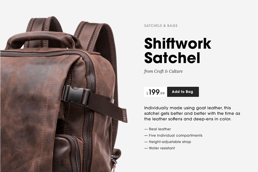
There may not be much copy on the average shop page, but copy appears in a lot of different places, each with a different purpose. A standard product overview section can contain over 7 varieties of content and metadata, such as headings, prices, and bullet points.
Using fonts to differentiate between two or three different text blocks is pretty straightforward, but achieving the same effect with five, six, or seven groups of content can be a lot more challenging. When done well, customers can quickly scan for the information they need and just as easily decide if they want to begin the buying process or keep browsing.

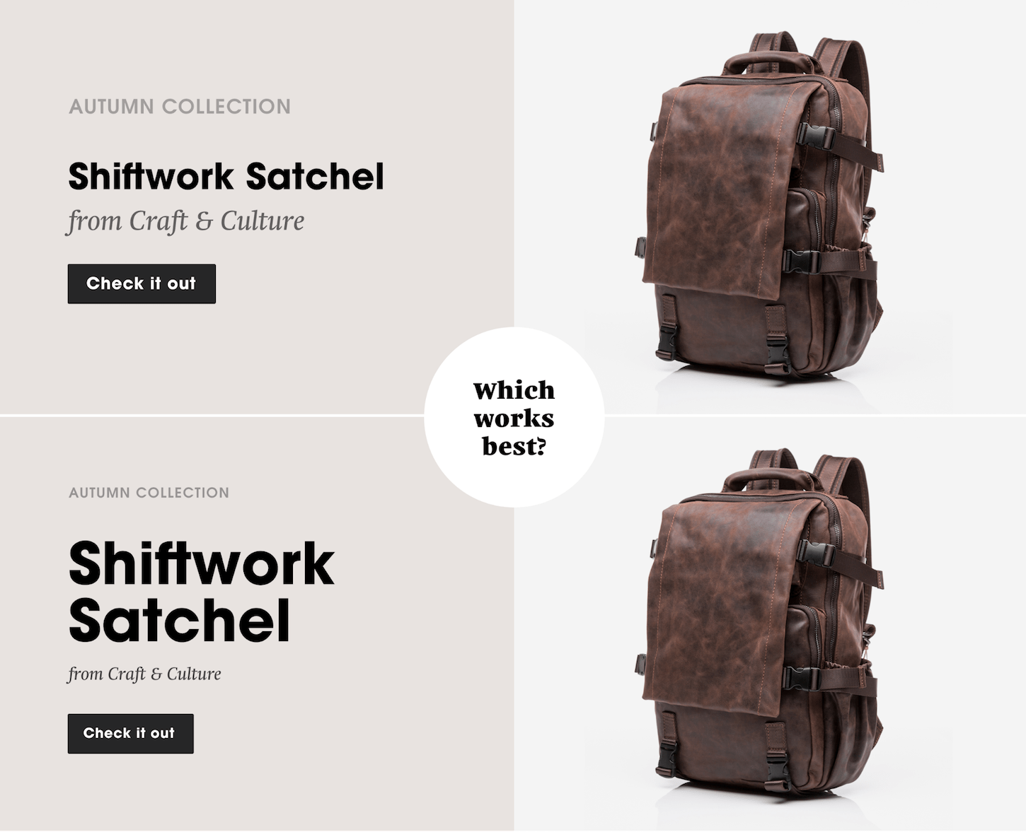
As the image above demonstrates, there are several type treatments designers can use to develop a clear, efficient hierarchy and shop flow. The key is to deploy these tactics consistently throughout your client’s site, so that users become familiar with the look of the site hierarchy, not just the text.
Here are 5 tactics to consider to create this hierarchy.
1. Scale and physical size
Simply changing the size of a line of text gives the eye a series of anchors throughout the site’s content. Product titles, testimonials, and some CTAs are often set in larger text to draw the eye.
The type scale becomes even more important as the screen size gets smaller, and text begins to do more of the heavy lifting over images and other interface elements.
Responsive design often requires eliminating nearly everything but the text for the smallest screen sizes, so having a clear, consistent font scale is crucial. In larger websites and apps, it can be important to settle on some predefined rules for managing the complexity of your type system.

2. Type style and weight
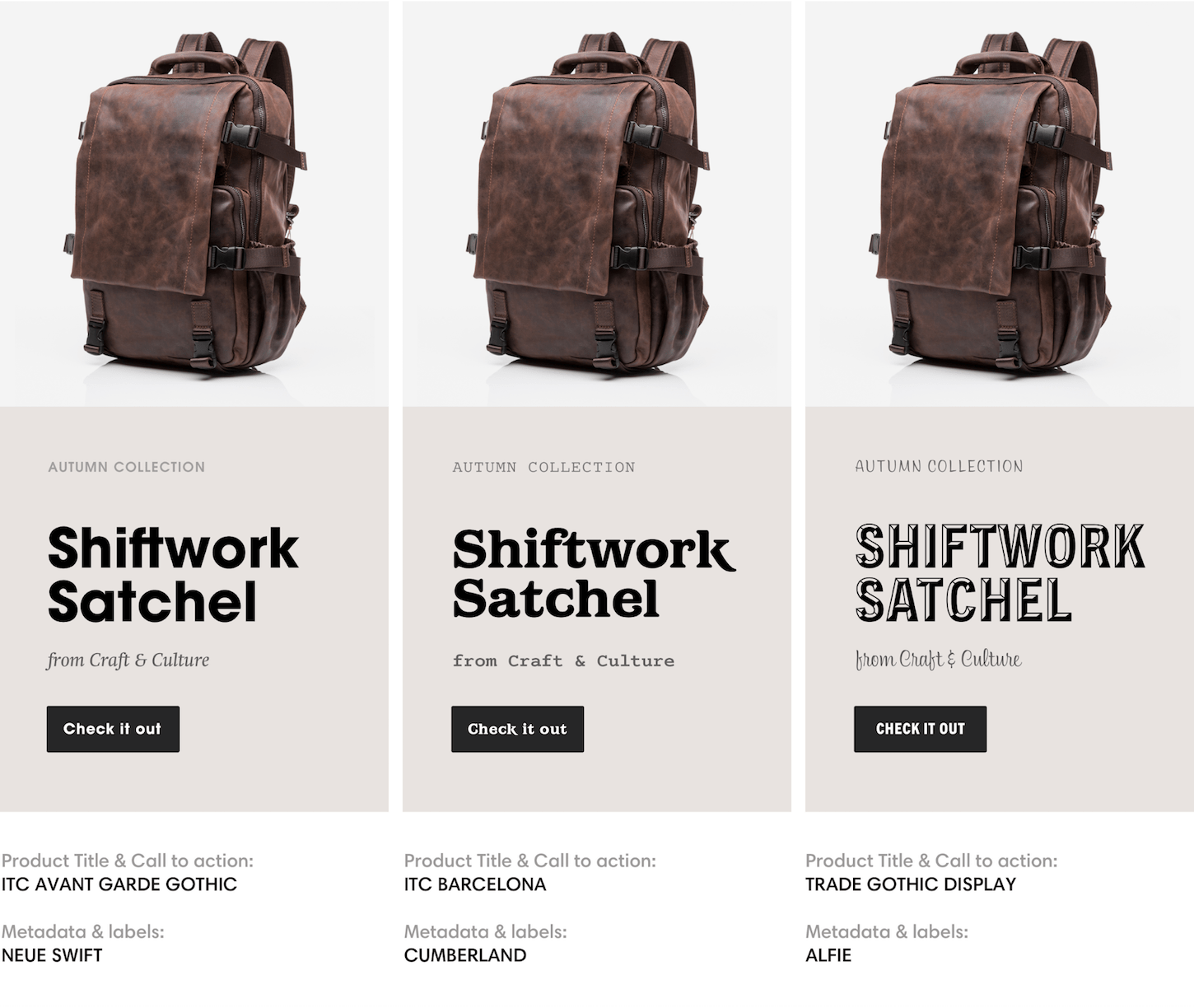
Use contrasting styles to set blocks of text apart, such as mixing relaxed hand scripts with no-nonsense sans serifs or monospaced fonts. It is generally good practice to create visual contrast through weight, like pairing bold headings with light body text.

3. Type case
Setting metadata items like subtitles and navigation in all caps can also create a contrasting effect. However, this works best with short sentences and increased letter-spacing to improve legibility.

4. Contrast against images
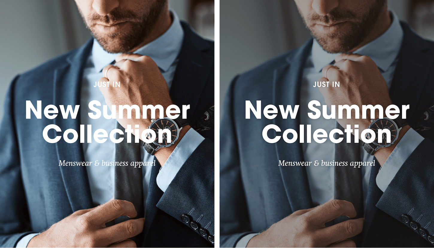
For layered text and images, consider reducing the brightness and saturation of the image. This can even be achieved at run-time with CSS filters.

5. Navigation treatment
The role of navigation is to be a clear, temporary step toward a user’s goal. Therefore, give consideration to the amount of typographic personality that you pull into navigation systems. Sometimes, good contrast and one typeface is enough—think of it as speaking the in the same tone of voice of voice but adjusting the volume. Too many extreme variations in a small space can send the reader scrambling.

The importance of type
Regardless of your client’s branding, these basic principles can help bring structure and clarity to the design of their shop. They also offer countless opportunities to test different combinations to see what leads to the highest engagement and conversion rates, so don’t be afraid to experiment. A little adjustment to your fonts can go a long way.
Ref. Shopify
for Professional Ecommerce Design/Development.
or Call (+234)7088169633


