
State of the art user friendly online store for women’s hairs and clothing


Like WordPress and some other open source php script using mysql database, Joomla password is encrypted in the database. This makes it difficult to decode a user password even from the database.
Joomla also does not support “forgot password” for a super administrator account. So an easy way out of resetting your password is directly on the database through phpmyadmin. Below are the simple steps.

You can disable automatic windows update in windows 10 using The Group Policy feature. This feature is not available in the Home edition. So, only when you run Windows 10 Professional, Enterprise, or Education, you can use the Group Policy Editor to change the settings to prevent Windows 10 from automatically updating. The group policy editor will notify you of new updates without automatically installing them.
Note: If you need to update your Windows version later, you can repeat the steps above, then select Enabled to turn on this feature, so that you can continue to download the updates.
Ref: EaseUS

WhatsApp, the social messaging service acquired by Facebook for $19bn in 2014, is arguably the world’s fastest-growing communication app. As on January 2015, half a billion people around the world were regular, active WhatsApp users. These users are sharing more than 700 million photos and 100 million videos every single day.
In India, its more popular than Facebook and even our maids are on WhatsApp now. It has already replaced SMS and fast becoming our primary mode of communication.
The question small business owners are now asking is: How can I use WhatsApp for business?
Lets look at the 6 creative ways to implement WhatsApp in your business..
People are though reluctant to ‘learn’ new things. Best thing about WhatsApp is that almost everyone uses it and it does not require any training. Another advantage is, I don’t need to explicitly ask the team to check WhatsApp as they are anyway hooked to it.
We have formed groups of Sales & Development team on WhatsApp and share instant messages for which an email is not necessary. Its fast and fun to use.
With WhatsApp Web, it becomes even more easier to type messages using a web browser.

Here is a sales tip – If you do your followups on WhatsApp instead of direct phone calls, you will get 40% more response. No one appreciates phone calls from unknown numbers but we are more likely to respond to personal messages. When we start using WhatsApp for customer communication, we noticed better response and engagement.
This also gives an opportunity to be little informal. For example, you have sent a quotation to your potential customer but haven’t heard from him, what do you do? You either call him or send a followup mail using formal language. Instead of doing this, if you just send a short message on WhatsApp asking about the status, you might get a quick response.
WhatsApp could be a great tool for customer support simple because of its wider reach. Your customers would always prefer to send you a message over WhatsApp rather than calling a helpdesk number or raising a ticket. You can talk to your developer to integrate an active Whatsapp support link on your website, such that at 1 click, the user will be redirected to Whatsapp Web (if visiting on a computer) or direct to Whatsapp App (if visiting with a mobile device)
NowFloats, a website development platform uses WhatsApp for the customer support. Arush Chopra from JustHerbs has been offering skin and product consultations on whatsapp. There are even new business like Wazapper that provide tools & API to setup customer support system using WhatsApp.
However, offering customer support via WhatsApp may not be a good option for all types of businesses. Kritika from cloud telephony company, MyOperator warns that responding to every message on WhatsApp may not be practical for companies that get hundreds of customer calls everyday.
So, choose WhatsApp as a customer support tool only if you have lesser number of customer requests.
Rajat Uppal, national marketing head, Red FM, says, “WhatsApp is the new SMS. We’ve realised that WhatsApp can be a very strong marketing tool. It is a good one-to-one platform for direct communication with our listeners”.
You can use WhatsApp to send images, audio files, short video clips of your products and text messages to users across the world. Unlike SMS or Email, there are less restriction on the format and delivery chances are higher.
This doesn’t mean that you should spam your customers with WhatsApp messages. Ideally you should use WhatsApp to connect with existing loyal customers rather than trying to reach new users. Everyone hates messages coming from unknown numbers.
If you really want to get a good response, you will need to come up with the creative ways to promote your business using WhatsApp. For example, Colgate invited people to send selfies of their smile via WhatsApp, to a phone number displayed on the toothpaste pack. Motivation: a chance to be styled by brand ambassador Sonam Kapoor’s stylist!
People have built new businesses using WhatsApp as a platform and some are using it to grow their business in a cost effective manner. Lets look at some creative usage of WhatsApp that might give you few ideas for the next project..
Concierge Service
This Mumbai-based errand-running service Russsh, uses WhatsApp as a booking platform. You can book a cake, flower delivery or courier service using WhatsApp.
Food Ordering Using WhatsApp
Lot of local restaurants are now offering their users an option to order food using a WhatsApp message. Customers can communicate their preference instantly.
Many do not know yet that Whatsapp has released its Business version to encoporate more features targeted at increasing sales, sales support, providing access to business details.
With Whatsapp Business App, you can display you business contact details, set offline messages, set custom automated welcome messages with options of adding links and do even more.
Whatsapp Business App is designed with same user interface as the regular version, so there is no fear of starting to learn to use.
Ref: profitbooks

When building ecommerce sites, a helpful term to remember is minimum interaction cost. This is basically the minimum effort required to determine if a piece of content is worth reading. A recent study by the Nielsen/Norman group found that on average, users only read 28 percent of words on a page at most. That percentage varies somewhat depending on the amount of copy on the page but, coupled with the fact that most people spend an average of 15 seconds on a web page, the numbers underscore a basic truth: every word needs to count.
This is where fonts come in. When used correctly, fonts can help draw a reader in, encourage them to stay on the page longer, and, hopefully, guide the customer successfully all the way through the buying process.
Fonts are crucial to creating the sort of smooth, intuitive experience that meets these demands. When used effectively, fonts guide the eye from one place to the next, keeping the user grounded as they browse products, compare features, and move through the purchase process.
There may not be much copy on the average shop page, but copy appears in a lot of different places, each with a different purpose. A standard product overview section can contain over 7 varieties of content and metadata, such as headings, prices, and bullet points.
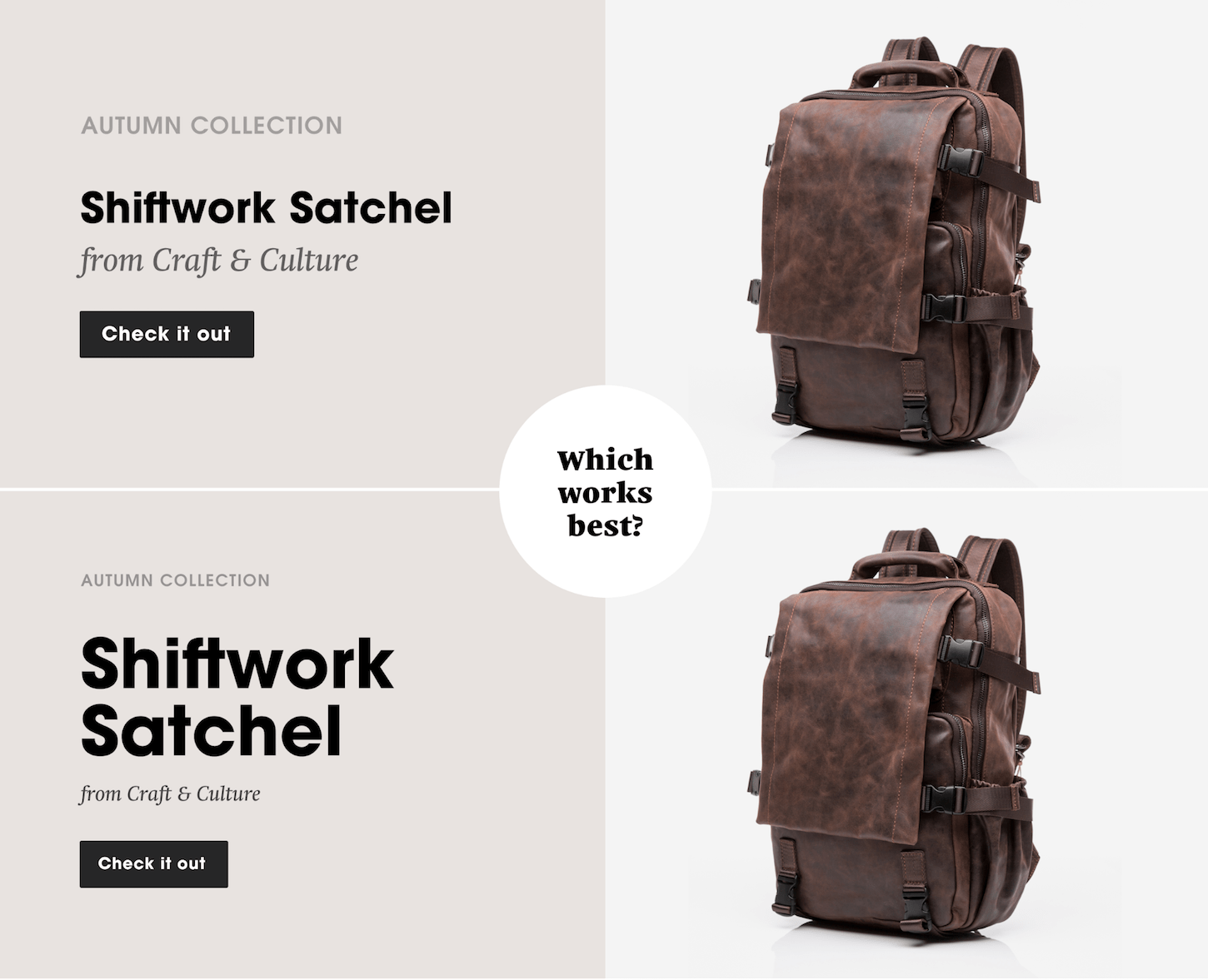
Using fonts to differentiate between two or three different text blocks is pretty straightforward, but achieving the same effect with five, six, or seven groups of content can be a lot more challenging. When done well, customers can quickly scan for the information they need and just as easily decide if they want to begin the buying process or keep browsing.
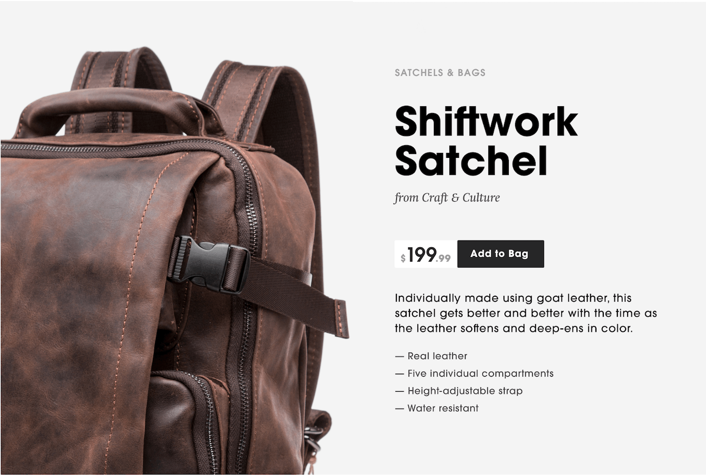
As the image above demonstrates, there are several type treatments designers can use to develop a clear, efficient hierarchy and shop flow. The key is to deploy these tactics consistently throughout your client’s site, so that users become familiar with the look of the site hierarchy, not just the text.
Here are 5 tactics to consider to create this hierarchy.
Simply changing the size of a line of text gives the eye a series of anchors throughout the site’s content. Product titles, testimonials, and some CTAs are often set in larger text to draw the eye.
The type scale becomes even more important as the screen size gets smaller, and text begins to do more of the heavy lifting over images and other interface elements.
Responsive design often requires eliminating nearly everything but the text for the smallest screen sizes, so having a clear, consistent font scale is crucial. In larger websites and apps, it can be important to settle on some predefined rules for managing the complexity of your type system.
Use contrasting styles to set blocks of text apart, such as mixing relaxed hand scripts with no-nonsense sans serifs or monospaced fonts. It is generally good practice to create visual contrast through weight, like pairing bold headings with light body text.
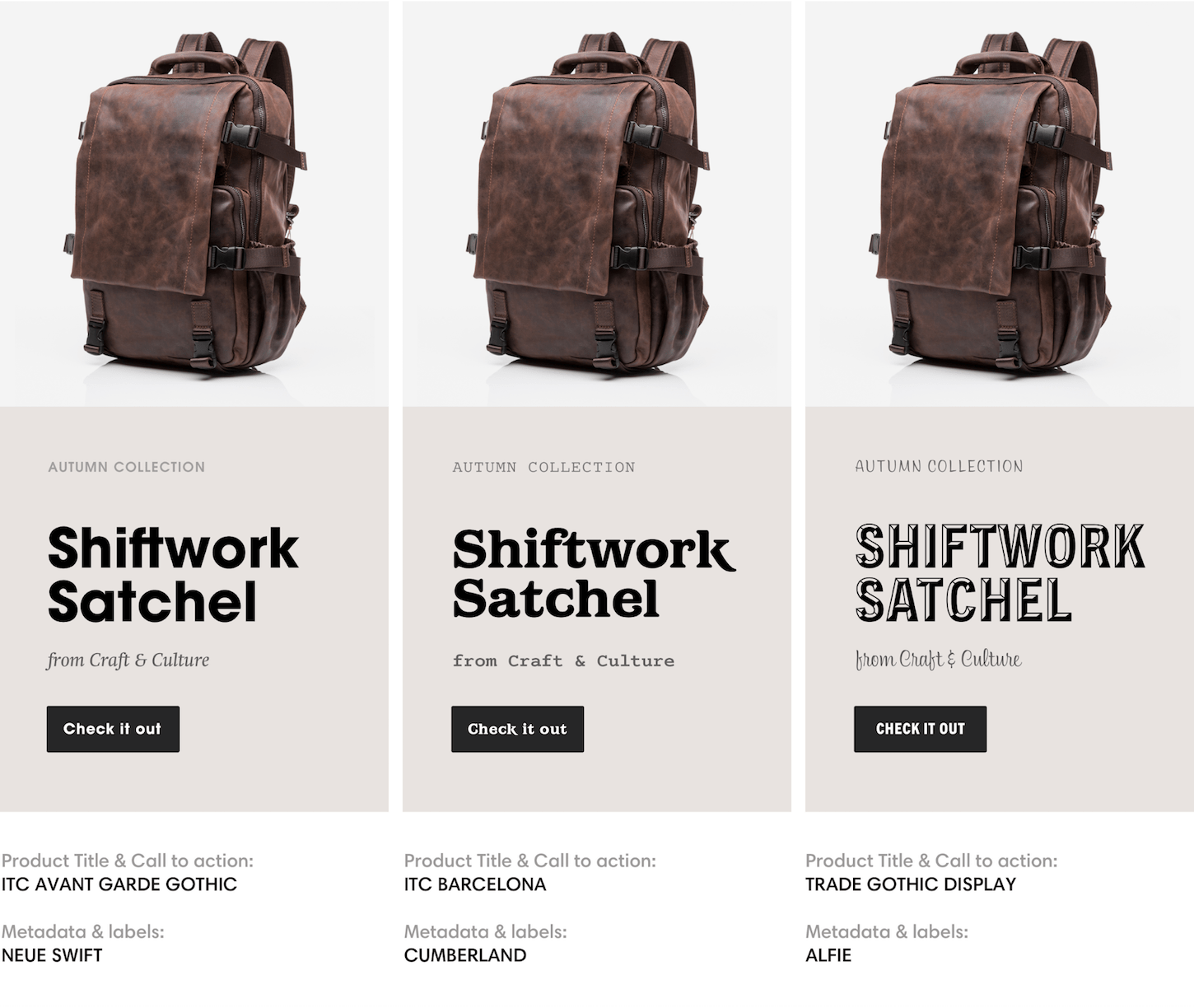
Setting metadata items like subtitles and navigation in all caps can also create a contrasting effect. However, this works best with short sentences and increased letter-spacing to improve legibility.

For layered text and images, consider reducing the brightness and saturation of the image. This can even be achieved at run-time with CSS filters.
The role of navigation is to be a clear, temporary step toward a user’s goal. Therefore, give consideration to the amount of typographic personality that you pull into navigation systems. Sometimes, good contrast and one typeface is enough—think of it as speaking the in the same tone of voice of voice but adjusting the volume. Too many extreme variations in a small space can send the reader scrambling.

Regardless of your client’s branding, these basic principles can help bring structure and clarity to the design of their shop. They also offer countless opportunities to test different combinations to see what leads to the highest engagement and conversion rates, so don’t be afraid to experiment. A little adjustment to your fonts can go a long way.
Ref. Shopify
for Professional Ecommerce Design/Development.
or Call (+234)7088169633

If your client’s ecommerce homepage is like a physical storefront, then the landing page is like a pop-up shop or a stand in the farmers’ market. A landing page is usually the first contact point for potential customers. It gives people an impression and taste of what a store sells, and invites them to explore further.
In this article, we’ll go over 10 ways to optimize your landing page for conversion and leave a strong impression of your brand and products.

The first method to creating an effective landing page is to design it in a way that considers the customers’ motivations, desires, and frustrations.
If you’re not yet familiar with the term ‘user-centered design’, it means to think like a customer, and tailor all content and services across touchpoints to be in line with what the customer wishes to understand and do.
Understanding the customers allows you to tailor the copy and design in a way that speaks directly to them. When customers understand that the products meet their needs or solve their problems, they are much more likely to convert. Thus, understanding the customers, or applying user-centered design, should be a part of the marketing strategy.
One way to keep your target audience profile in mind during the design process is to create personas. A persona is a snapshot of your ideal customer profile, with information on their age, language, income, motivation, goals, and problems they’re looking to solve.
To create realistic personas, the best way is to talk to real customers, and get to know their pain points and the steps they take to solve a problem. For example, what leads this thirty-year-old entrepreneur to look for a new backpack? What is the keyword they will search? What features are they looking for in this product? How does the customer compare similar products, and what factors drive their purchase behavior?
With personas, it becomes much easier to think about what customers want and what to include on the landing page.

Viewers focus on the headline first when they come to the landing page. Often, the headline is about the product or a product feature, like ‘dot grid notebooks’ or ‘durable leather goods’. These kinds of feature-oriented headlines do not tell the user what’s in it for them or the importance of having the product in their lives.

A benefit-oriented headline focuses on the awesome person/home/atmosphere that the user will have or become once they own the product.
Jakub Linowski, a conversion coach, ran a test on an empowering benefit-oriented headline versus a normal headline. The result? The benefit-oriented headline increased the conversion rate by 4.3 percent.
By focusing on the value to the user, prospects are much more likely to convert than if you just talk about the company and their products.
A landing page is more than a product listing or detail page, and one of the key elements in a landing page is the content.
It should be created to address the following questions:
One of the best ways to craft effective content is to use the exact words your prospects are searching or saying, in line with their needs and goals.
Lorem Ipsum is well used by designers as placeholder content when clients aren’t able to supply the real copy. It can seem that this ‘fill in the blank’ approach works, but in reality, actual content almost never fits into placeholders.
If the content doesn’t fit the design, you must either start over with a new design or alter the content to make it fit. Neither is ideal or efficient.
The more effective approach is to adapt content-first design and make developing content early a top priority.

As mentioned above, the purpose of a landing page is to get visitors to take action. It’s tempting to include bits and pieces about the products, but this overloads the landing page with too much stuff.
According to marketing experiments, 48 percent of landing pages contain multiple offers, and this is not a best practice. Instead, you want to have one specific offer for each landing page, to keep the prospect focused on one thing at a time.
By using just one call-to-action and removing all elements that are competing for the user’s attention, this laser-focused landing page will convert better.
Design tip: the CTA color should contrast with the rest of the page and color scheme to draw the eyes of the reader to the CTA, as custom apparel company Bonfire does on their landing page.

The CTA is the trigger of the conversion, and so you want to make the offer as appealing as possible. For similar reasons as why you should make the headline about benefits, the CTA text should communicate benefits as well.
On the internet, we see buttons like ‘click here’ or ‘get access’ everywhere, but these don’t show any context or clues about where the link might go. Users have to do the extra work of guessing what happens after they ‘click here’.
Instead, make CTA buttons and links more descriptive, and include why the user should click the button.

Compare these two CTA buttons: ‘Get Instant Access Now’ and ‘Read Full Essay Now—which one is more descriptive and clear about what the button actually does?

In the first one, the user has to pause and think about what it is that they will gain access to. In the second one, the user is clear about accessing the full essay. It’s not surprising that the clear CTA copy increases the conversion rate by a whopping 39 percent!
Ninety-four percent of the user’s first impression is related to design elements. So the first impression of the landing page has a lot to do with the visual design.
Professional designs that wow users also give an impression of better quality. Therefore, clients should hire a professional designer like you who can best communicate their brand values and products through designs.
On the contrary, the highest bounce factor (that leads users to leave your landing pages) are attributed to annoying elements, such as pop-ups, surveys, music, and auto-playing video. Generally, interruptive elements that are initiated without the users’ permission result in a negative reaction and worse user experience.
Landing page content can be short or long. The amount of content you should include depends on what kind of products your client is offering.
Here are some general guidelines for determining the length of the landing page:
Short copy performs better when the offer is free, very cheap, or an impulse buy. For these kinds of products, you want to reduce the viewer’s reading and thinking and let them go straight to purchase. Behind this type of purchase, there aren’t a lot of barriers or complex thinking.
Long copy is more suitable for expensive or complex products. When rational thinking and analysis are factors for the purchase, longer copy with explanations, proof, and testimonials creates a more compelling case.
In a nutshell, the more expensive the product, the longer the copy should be.
According to Baymard Institute, a complicated or long checkout process is among the top three reasons for cart abandonment (28 percent). This includes requiring users to fill out long forms.
The more fields you ask the visitor to fill in, the more friction it creates, and therefore, the fewer people want to go through the process. Ideally, your checkout forms should only ask for the minimum information needed—where to send the item to, and who is paying for the item.
Marketers usually want more information for marketing purposes, like the customer’s gender, what items they like to shop for, or their birthdays. But this works against the user experience. Customers aren’t shopping on the site to give out all their personal details, so that your client can send them an ad on social media.
Before you create a long form, first ask yourself—why is this information necessary? Why do we need this now? Remember, you can always gather more information later on.

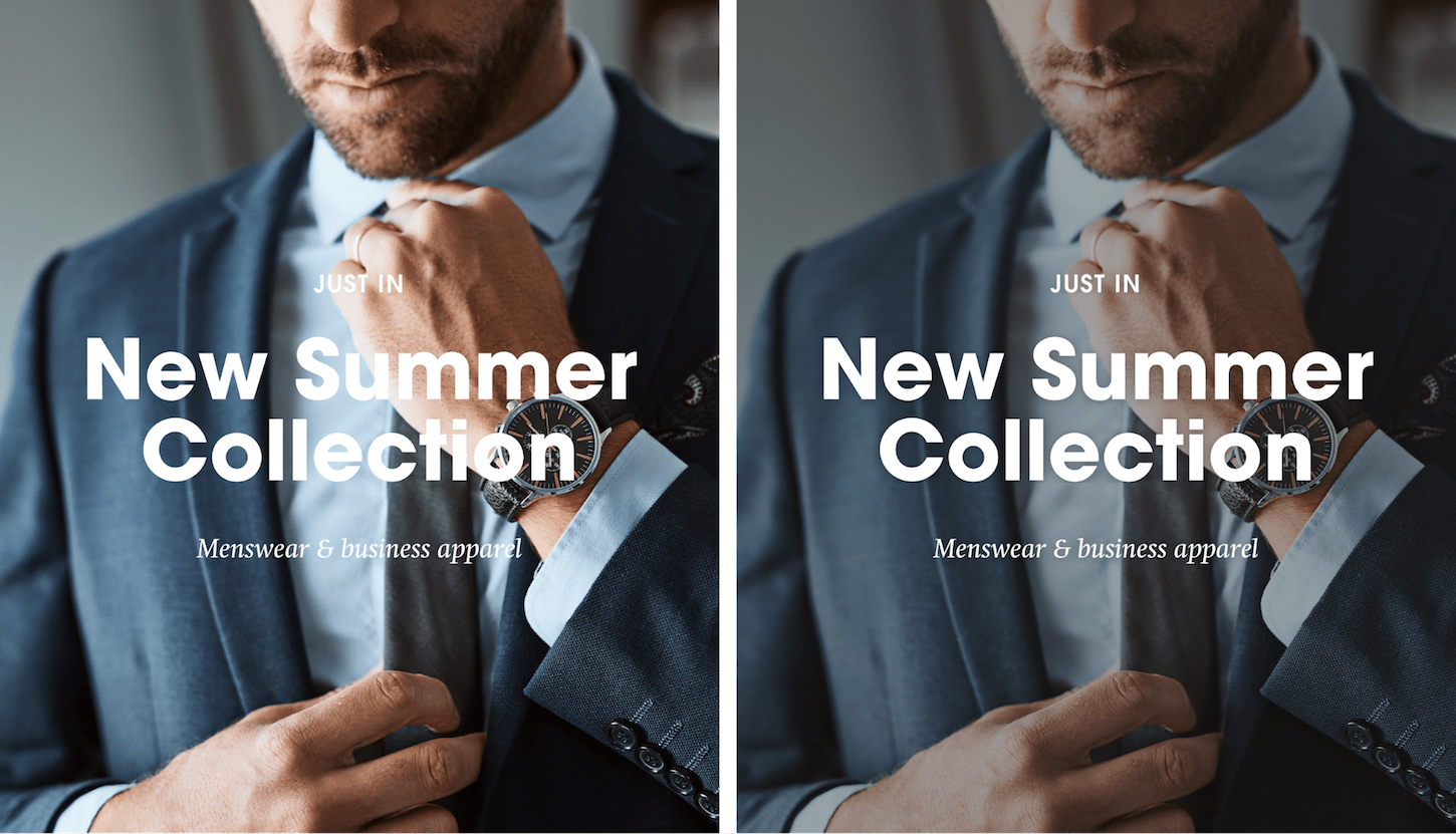
A moving or animated eye-catching masthead can increase conversions up to 86 percent. In a highly competitive market, it may be what you need to create a strong impression of your client’s brand and products.
However, the effectiveness may depend on the target audience. For example, video/animation headers are not suitable for antique products being sold to an older demographic.
If you want to consider using animations or videos on the landing page, start by identifying the unique elements of the products or brand that can’t be communicated easily with static text and images.
It does take more time to create an interesting masthead video or animation, but if you do it right, it will help your client’s brand be more memorable and perceived as high quality.
Ref: Shopify

A website for your business is no longer a luxury — it’s a necessity. But, just because you invested in a website doesn’t mean that it’s effective in connecting with your customers and ultimately improving your sales. While there could be numerous reasons why your website isn’t effective, here are 10 of the most common explanations for website fails.
This shouldn’t come as a surprise to most of us, but for the first time ever mobile and tablet usage surpassed desktop usage. As the mobile revolution continues to grow around the world, this trend toward “on the go digital,” will continue. In other words, internet consumption is moving away desktops and in to the portable devices territory. This means that your business’s website has to be optimized for mobile users.
Unfortunately, there are still lots of websites that aren’t mobile-friendly. This is just bad for business since it can lead to penalties from the Big G (Google), decrease conversation rates and deliver your customers a poor experience.
To make sure that your site is ready for mobile users, make sure that you use a responsive design, have large buttons and due your due-diligence on a/b testing, keep your layout simple and again, test it using tools like Google’s Search Console Mobile Friendly Test.
I understand that you’re an expert in your field and that you want to demonstrate your knowledge and authority. But unless you’re talking to directly to your fellow industry experts, your average customer isn’t going to understand the technical language or industry jargon that you use to describe your business throughout your website.
Avoid the jargon and use simple and straight-forward language that your customers can easily understand.
Your customers have a problem. And they’re turning to your website to help them solve said-problem. That’s why your website needs to contain fresh and valuable content that answers real-life questions.
Remember, that doesn’t mean that they’re searching for your exact business. For example, our blog contains useful information for freelancers and small business owners. If a person is searching for advice on invoicing and processing payments, they could also land on our site because that’s the type of content we’ve been producing, as well.
In short, start a blog and keep writing awesome content. This will also help boost your SEO and content marketing efforts.
Besides looking for information that will make their lives better, if customers are looking for your specific business, they want to easily locate information like:
You’d be surprised at how many businesses still don’t have this information on their websites. And, if you’re like me, you may tend to stay from those types of businesses over security or legitimate concerns.
Customers expect a website to load quickly. In fact, 47 percent of consumers expect a website to load in just 2 seconds or less. And, that’s important to remember because an astounding 79 percent of shoppers who don’t enjoy their website experience less likely to ever return to that site again, nor buy from that site again.
You can test the speed of your site using tools like Pingdom and GTmetrix. These tools provide insights and advice on how to speed your site-up too.
You don’t want to leave your visitors in the dark by making them guess what you want them to do next on your site. So, give them clear instructions by creating a call to action button or hyperlinked text that is front and center.
HubSpot has 31 call-to-action examples that you should review if you need some inspiration. For instance, Dropbox has a blue “Sign up for free,” call-to-action button that stands out from the rest of the page.
Remember, without these buttons, your potential customers won’t move forward with the services or resources that you’re offering. When that happens, you won’t get those all-important business conversions.
Webpages that are maintained and have a current design build trust and credibility. That doesn’t mean that you need to update your site every month. But, if it’s been years since you’ve had a major website design overhaul, then it’s time to find something more contemporary. The last thing that you want is to have a site that looks like a Geocities page from the late 90s.
Believe it or not, that are still businesses that insist on having websites that have music or videos play automatically once your enter the site. Even worse, these sites are also full of banner ads, bright colors and flashy text. These sites are just plain annoying and end-up slowing the page down because it’s so cluttered.
So, how many people are going to ever click on that site again at work — or anywhere else?
Keep in mind that a bulk of your visitors are browsing your site on mobile devices too. This means that you’re site should be clean and organized. Keep information to a minimum and use sub-headings, bullet lists and graphic elements so that visitors can digest this info in smaller chunks.
Unless you’re relying on a third party payment gateway or shopping cart, then it’s your responsibility to frequently check to make sure that everything is working properly. You won’t be able to make a sale or receive a payment if your cart or payment processor is busted.
A lot of businesses send all their traffic to their website’s homepage, as opposed to relevant links that their customers actually want to land-on. This could be because service pages and other pages of the site are just an afterthought when designing a website. But, the fact of the matter is that the home page isn’t as important to general web traffic and the overall design.
Instead, start creating specific landing pages for the various types of potential customers you encounter and where they are in the sales funnel.
Source: Entrepreneur

I experienced good training & mentoring from Vallatest Technologies. They are very good at what they do. I wholeheartedly recommend them to anyone looking for a total web & branding solution.

Do you know you can resize up to 150 images in 60 seconds on any computer?
All you need to do is to open a page on on your computer browser. Do not border, you are not going to upload any image to the internet. Everything happens on your computer once the the web page has been opened.
To cut the long story short, follow the following steps;
1. Visit www.bulkresizephotos.com

2. Click on “choose images” and select all the images you want to resize (up to 150)
3. Click start and watch them get processed
 4. After resized, you will be opted to save the new images (zipped).
Enjoy…

This training is the best of it’s kind. I have been exposed to tools I need to be self employed and I am sure going to start applying them. I wish the training can continue. Thank you, Vallatest Technologies Team.